

Integrate a flat-rate phone plan into an ecosystem built around multi-line volume discounts and complex phone subsidies - without destroying conversion rates, on a dramatically shortened timeline.
This was difficult for several reasons. The existing sales flow was designed to reward volume through discounts (e.g. "Save more when you add 4 lines"). Forcing a flat-rate, subsidy-free plan into this structure in such a short time, while not compromising on customer experience, was asking a lot of myself and the design team.
Ultimately, “Simplicity” is only a simple as it seems to customers.
The existing sales flow was designed around a symbiotic relationship between phones, plans, and promos. Customers could pick a premium phone and/or myPlan tier to unlock significant trade-in credits and discounts on perks (like various streaming services). Simplicity turned this structure on its head by decoupling phones, plans, and promos.
One of the biggest priorities was educating the customer within the flow - since existing customers were used to different promo structures and plan pricing, and new customers were new to it all. The first step of supporting Simplicity in the sales flow was updating the configurator page to support the plan and new add-on shopping experience.

Image 1. Updated configurator page for Simplicity - now page is focused on adding on extras to the plan, rather than focusing on plan selection.
Because the goal of this page was to allow customers to add everything they want to their cart, understanding pricing is a chief priority. We built an interactive module that showed 36-month device payments alongside the lower flat-rate service fee. This allowed customers to directly compare and see that paying full price for a phone on the $45 plan often resulted in a lower total monthly bill than a "free" phone tied to an expensive plan tier.
With Simplicity, the business introduced discounts based on bringing an existing phone bill or phone number(s) from another carrier. To entice customers from rivals, customers can unlock $15/mo per line savings versus standard lines (i.e. without bringing a bill or phone number).
The business required us to list the discounted the price on the site, which in turn required my changing the phone number selection step to (1) encourage customers to bring a number or bill from another carrier and (2) deprioritize finishing the number port process within the sales flow.
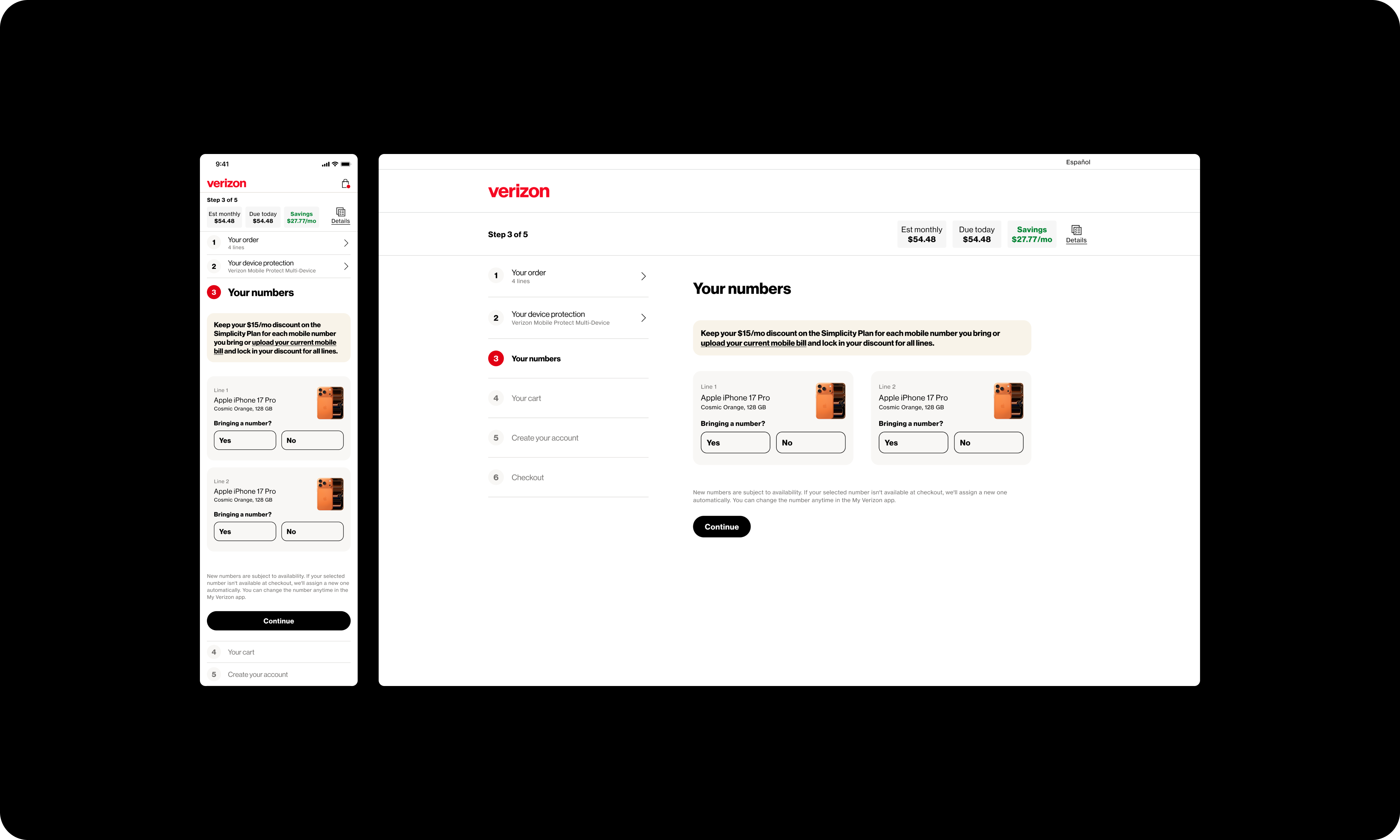
Image 2. To stay consistent with the new pricing scheme, the phone number selection page was modified, focusing on messaging for customers to retain their plan discount.
If the customer hasn’t already uploaded a bill from another carrier, then they will see messaging about taking advantage of the discount. If they choose to bring a number, they’ll see that they’re getting the discounted line price, and we don’t show all the relevant carrier fields for porting a number in this moment. instead it’s hidden behind a modal - click on the link [link name] and a modal comes up that explains the port process. If the customer really wants to port their number now, they can choose [button name] and then the relevant fields for carrier info come up and they can complete the steps required on their end for the number porting.
This was done so that customers would spend less time on this page, and hopefully progress at a higher rate to the next page (although customers were progressing at a high rate already) and place orders at a higher rate. With more time collecting data from this MVP experience, we’ll be able to figure out how the changes are impacting customer behavior. [rework]
Due to the speed and complexity of this work, we built the new Simplicity experience so that it sits alongside the existing myPlan flow. This is tricky because the flows use completely different structures for plans and pricing, and customers aren’t able to be simultaneous customers of both. This leads to many different variants of flows and pages due to accommodating many entry points.
The most important thing, to me, with our adapting the sales flow was to share as much as possible with myPlan journeys. Instead of maintaining two significantly different sales funnels, the experiences stayed as similar as possible while accounting for different requirements. We built interchangeable UI blocks that rendered dynamically based on the plan type in the cart. This allowed us to reuse as much code as possible, which turned out to be highly valuable, especially with such a shortened timeline like this.
The target continually shifted throughout this very quick-moving process. Every day, decisions would be made or changed so that there was new (or recurring) work for at least design. Additionally, due to the scale and speed of this project, the other major difficulty was keeping key stakeholders up to date on the latest information. As a major sales flow update, this launch required cooperation across many parts of the company.
The solution to such high flux was multiple daily calls with stakeholders and specifically, design walkthrough with engineers where we’d answer questions in real time about how a component should work or appear. I created a series of new components for these pages to minimize the (repetitive) design lift, and we worked our hardest to get this out in time.
As part of the Simplicity release, I redesigned the legal agreements experience. My goal was to streamline the process and save customers time - especially since the number of required agreements was increasing.
The previous agreements experience displayed each agreement in its own modal, and required customers to scroll to the bottom of each one, where they were then able to click a button to digitally sign the agreement and move on to the next.

Instead of presenting each agreement on its own and requiring a (potentially) lengthy scroll interaction for each, my goal was to cut down on the number of pages and necessary actions.
I wanted to house everything on one page and remove the need for such significant interactions for legal consent. My solution was, therefore, to get all the agreements visible on one page and express consent through clicking of checkboxes.
The customer can still open and read each agreement, but is no longer required to scroll through the entire document. Now, customers can spend significantly less time on this part of the flow. Exactly how much less time is one of the key metrics I’m looking forward to seeing…

The Simplicity Plan has recently become live - so we’re in the process of collecting customer data and feedback, which we’ll use to inform enhancements to the sales flow
This project felt like a lesson on how difficult it can be to deliver “simple” to the customer; and what “simple” really means anyway. Myself and other designers often asked how simple this really was for customers if we needed to bend over backwards in multiple ways to accommodate the “simpler” structure for customers.
Like always, there were compromises that needed to happen to get the work done. We delivered an adaptive, intent-driven journey that gives customers value in a completely new way while successfully maintaining the existing sales experience.

