

Redesign the Verizon online fulfillment experience to care for complex split fulfillment scenarios and drastically increase how many order types can be placed. The goal was to modernize the experience while maintaining simplicity for the customer, despite the increased complexity to develop.
As part of the Next Gen Digital (NGD) work where we redesigned the online sales flow and achieved a 6x ROI, I was able to work on the fulfillment experience across three different iterations. I'll talk about that process and how the design evolved.
The NGD fulfillment experience initially launched with the NGD MVP, and it combined the fulfillment and payment steps into one page. This was a new direction for the fulfillment experience, which was contained in its own page previously. Because the design brief was a simplified sales flow, we decided to combine these pages.
Ultimately, this became one of the core tensions across the NGD enterprise - the need to minimize pages in favor of a simplified flow while still maintaining an easy experience for customers. In other words, find the balance between simplicity and resolution, all while decreasing clicks.
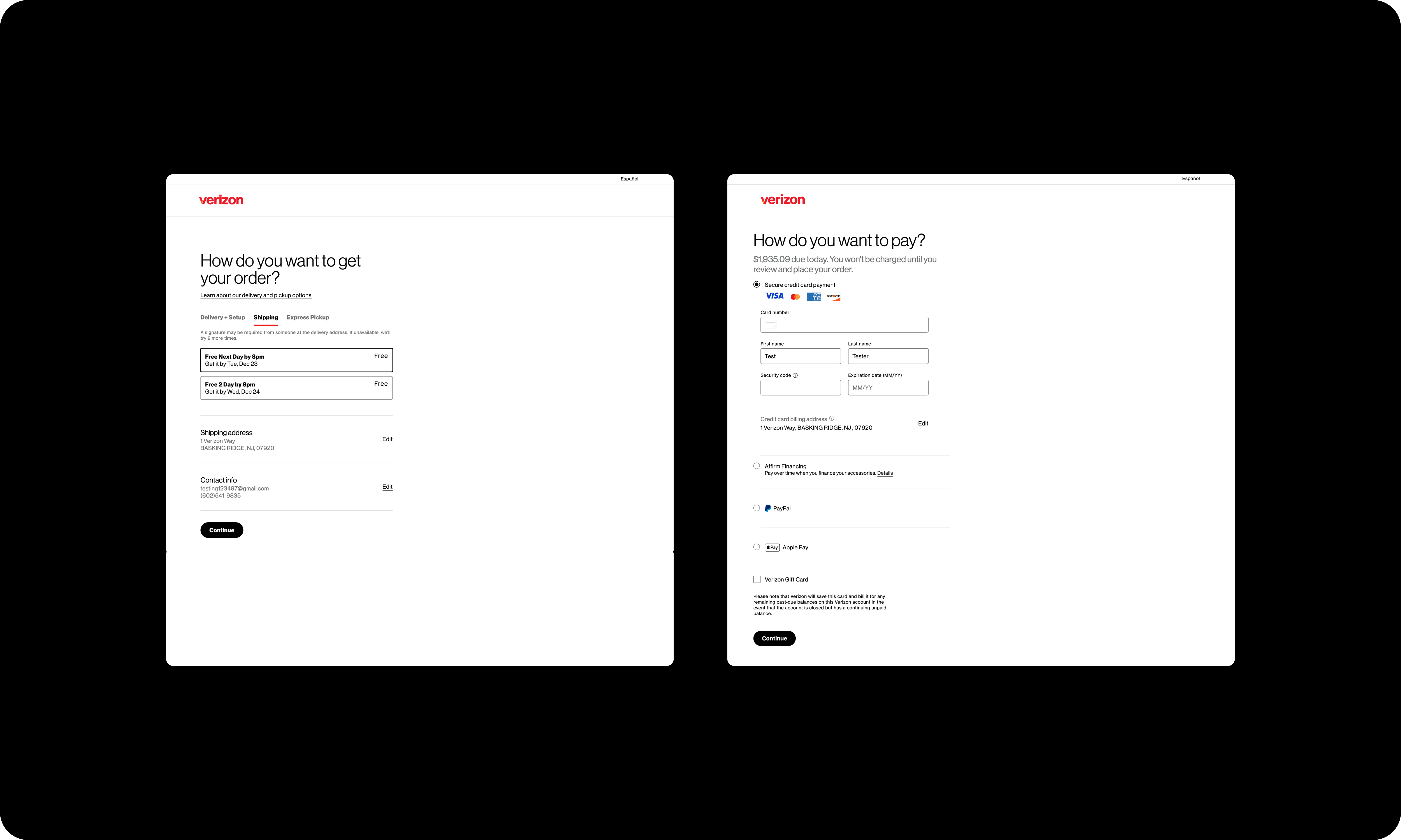
Image 1. (In updated styling) current "old-gen" fulfillment page (left) and payment page (right).
This first iteration of the fulfillment experience was embedded into the checkout page (Image 2) - which also contained modules to choose a payment method and review legal agreements. The customer clicked on the “Edit” link to explore fulfillment options within a modal.
While the checkout page was efficient in a sense (because the customer could do a lot on this single page) it also required customers to parse a large amount of content. They were making multiple important decisions spanning fulfillment, payment, legal agreements. Because of this, each module needed to have minimal content on the page.
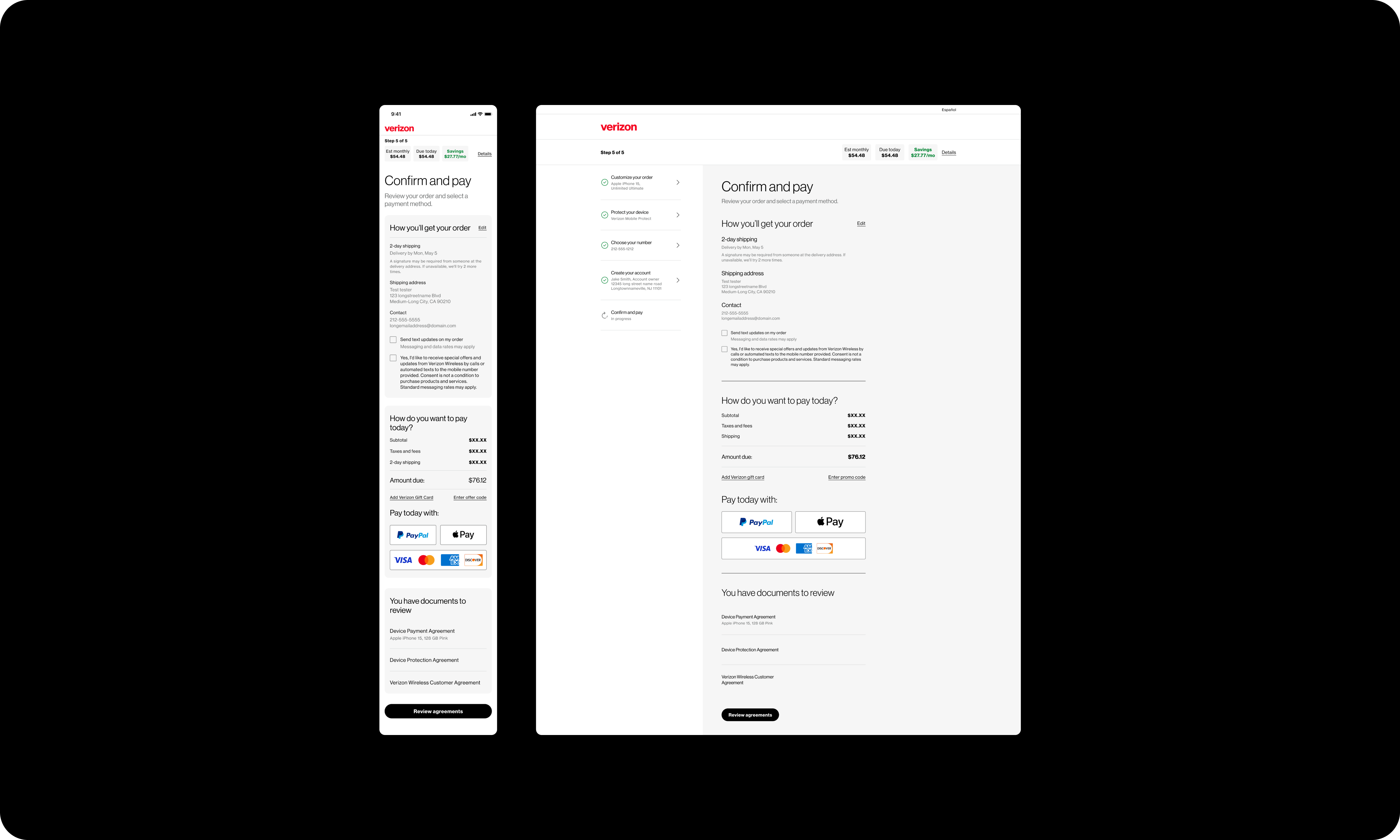
Image 2. The first iteration (MVP) of the NGD fulfillment step - combined with payment to comprise the final page of the sales flow.
After reviewing customer data and feedback, I reconsidered the approach to combining the fulfillment and payment steps. I found that some customers were being distracted by the amount of content on the page and order conversion was lower than we wanted it to be.
I learned from our analyses that customers were often clicking between fulfillment methods, exploring what was available - and I found that these customers were placing orders at a higher rate than other customers. Because of this, I started to think through separating the fulfillment and payment steps for the next iteration of the flow.
Armed with my data, I argued to our leadership that we should return the design to two separate pages. I argued we needed a clearer path through the page and that exploration was a crucial mechanic of conversion - that these changes would increase order conversion.They agreed, and I went back to the drawing board...
Because the data showed this tendency to explore the fulfillment options, one of my main priorities for this second iteration was to make the comparison process easier.
I played around with some different layouts to house the various decision points... Ultimately, I figured the most important decision on the page was how the customer was going to receive their order - choosing between delivery and pickup. Because of this, I decided to expose this decision at the top, using radio boxes to make this fork in the road salient and primary (Image 3).
I built in two levels of default selections. On page load, I defaulted customers to the most common fulfillment type (shipping), and preselected the fastest no cost shipping speed (usually free 2-day). When the customer clicks "Pickup" the nearest in-stock store is preselected. So in one click, the customer is able to compare the best delivery option with the best pickup option.
“Call a restaurant; they say it’s accessible, then you get there and there’s 1 step to get in... their view of accessibility is somewhat different than what yours is.” - wheelchair user
Image 3. The second iteration of the fulfillment redesign, in production now.
My thinking here was that the sooner the customer can (learn about and) choose a fulfillment option, the sooner they will feel comfortable proceeding in the flow (and hopefully placing an order).
If the customer wants to make a within-method decision, this is done inside a modal, like in the previous iteration of the experience. I found that customers continued to click back and forth between delivery and pickup, and that these customers that were exploring were more likely than other customers to place an order. It was highly reinforcing to see that this behavior persisted after my design changes. A satisfying win for data-driven design!
Initially, I heard feedback that customers preferred the multiple entry points to make edits in this fulfillment experience, compared to the single entry point in the previous experience. In that design, there was only an "Edit" link wherein the customer edited fulfillment method, contact info, etc. In this iteration, customers have multiple specific entry points, which led customers to frequently mention feeling "in control" using this design - a sentiment I didn't hear about the previous iteration.
After about six months of this fulfillment experience being live, we requested a full end-to-end fulfillment audit from a major consulting firm. This audit analyzed survey and interview data with real customers who used the live experience as well as a competitive analysis with other retailers and telecom providers. There were several problems customers were facing, zero of these were design problems.
The page behaved like customers expected and enabled the quick comparison of fulfillment methods and led to feelings of being "in control."
This current iteration of the fulfillment experience was initially intended to care for complex scenarios with multiple fulfillment types being used in a single order - we call these scenarios “split fulfillment.” The goal was to build a more robust fulfillment experience so that it can better align with the specific, complex needs of individual customers by allowing them to place a greater variety of orders online.
Additionally, leadership added secondary goals:
Normally, I'd push back on both of these secondary goals, particularly the latter, since there's no specific rationale for this design outcome. However, this project was high-visibility and therefore high-ranking leadership gave this direction... frankly, a less-than-ideal discovery stage.
In short, this is a design solution to solve supply chain puzzles for the customer. As the only designer working on this experience, I felt it was important to come up with some ground truths to use as a foundation to my thinking as well as a means of functional evaluation. The core tension in this design was always the battle between resolution/control and simplicity.
To that end, two things I felt from the beginning were that:
Originally, I drew up concepts that allowed the customer to manually split their order at will. I moved away from this approach because I was unsure it was the right amount of control to give customers - it seemed like overkill when I began to extrapolate. This approach would also allow the customer to more easily feel the rigidity of our business rules, since they wouldn't have full flexibility to choose any fulfillment method for any item. I think it would have felt like a bait and switch, since the implication from giving this manual split button is that the customer then has "full" control over their fulfillment choices; this isn't the case.
I also had conversations with my engineering partners where I learned how complicated it would be to build this functionality initially, but likely simpler to maintain in the long term. Regardless, I chose to pivot away from manual splitting - it was clear it was too much control for customers and that it would result in less feelings of being in control.
My goal now was to move more toward simplicity, away from control. One concrete way to achieve this was to expose the fewest amount of choices for the customer to make - using (1) intelligent default selections and (2) grouping items together based on these intelligent defaults. In the happiest of all possible paths, the page should require no interaction on the customer's part.
I came up with the base principle to only split the order when there is no alternative. An order splits when the customer selects a fulfillment method that isn't available for all items in the cart. The eligible items are then assigned to that new fulfillment method, but the remaining items remain assigned to the original fulfillment method (since they aren't eligible for the new method).
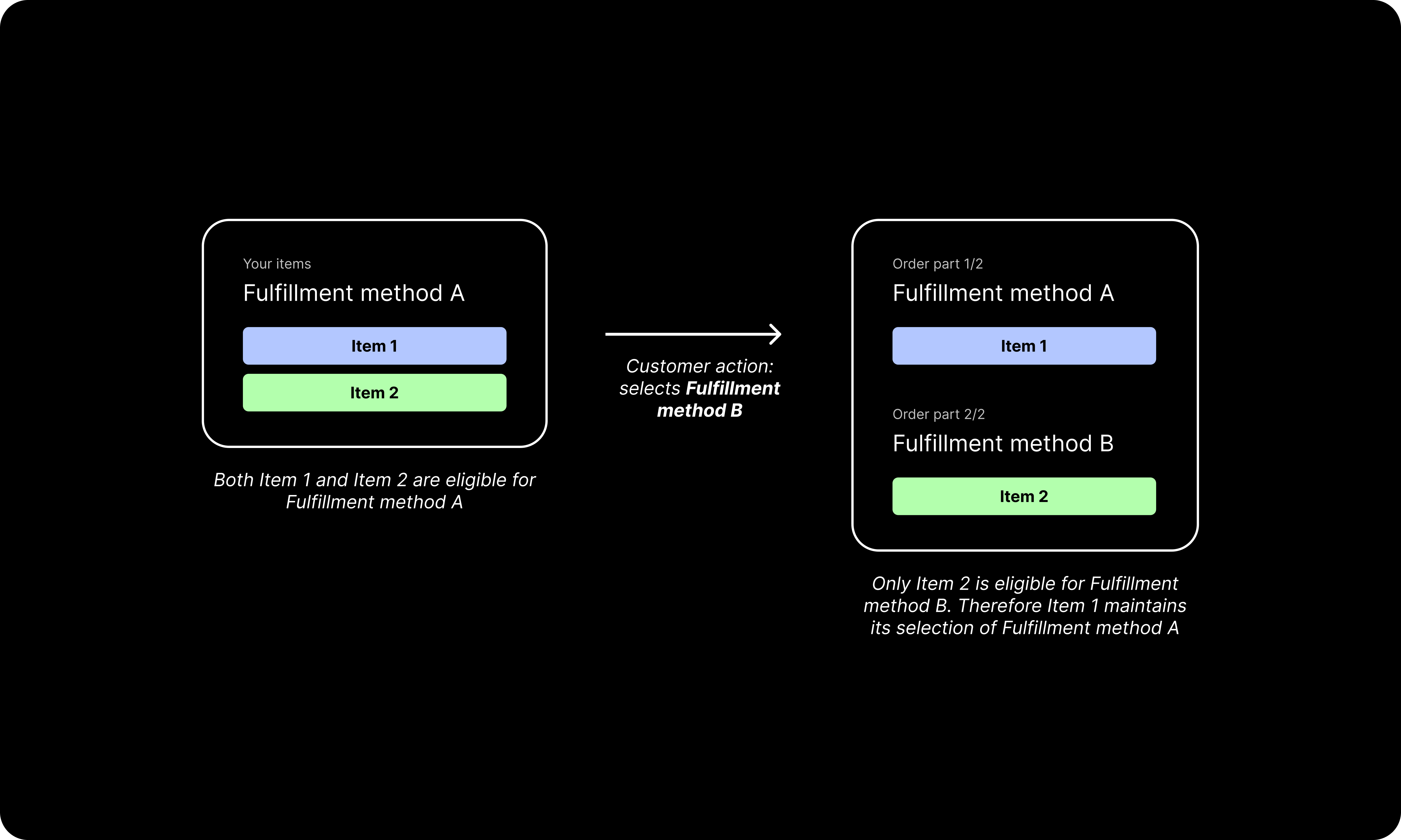
Image 4. Basic demonstration of how an order can split based on customer action.
The other base principle in this split fulfillment design is that of recombination. This means that parts of an order that have the same fulfillment method will visually (re)combine to simplify the page view, information architecture, and increase scanability for the customer. Again, the sooner the customer feels comfortable with their understanding of their order's fulfillment, the sooner they're going to progress from the page - increasing the likelihood of placing an order.
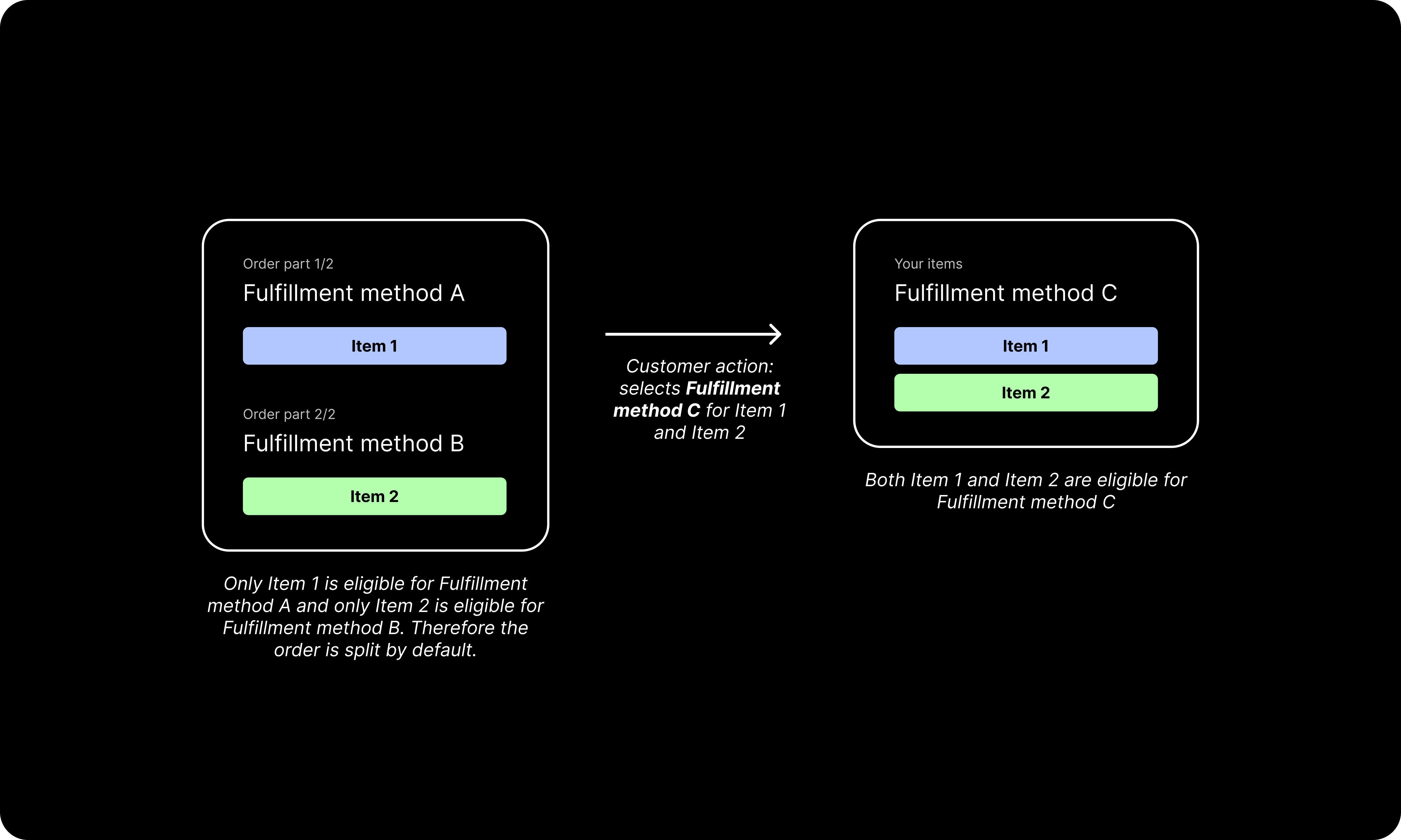
Image 5. Basic demonstration of how an order can recombine based on customer action.
Despite how complicated scenarios can get with multiple item and fulfillment types, these basic rules of splitting and recombining persist and serve as the foundational logic behind the experience.
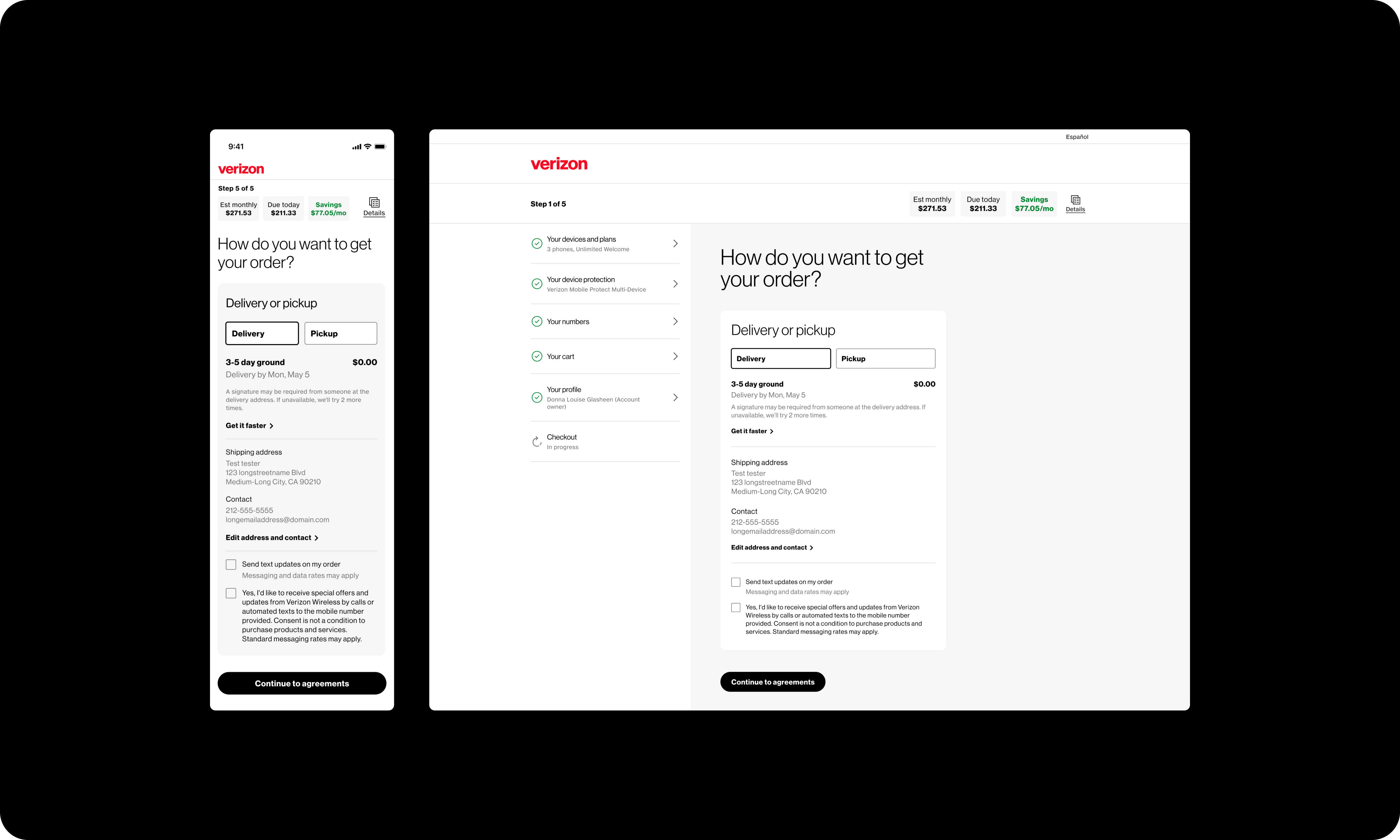
Given the sales goals of "Pro On the Go," this specialized, expensive fulfillment method, leadership asked for a more prominent placement for the method on the page. In the previous iteration, it was accessed via the "Get it faster" link, which shows the various delivery-based fulfillment options.
The winning treatment for exposing "Pro On the Go" in a more salient way was to surface it as a page-level decision. Now, instead of only showing buckets for delivery options and for pickup options, there’s also a bucket for “delivery and setup,” specifically postured to emphasize the singular fulfillment method in that bucket. Leadership was very happy with this design approach and took it one step further... asserting that we should default the customer to this expensive fulfillment method.
I argued (fiercely) against the idea to default customers to a paid fulfillment method. Simply put, this is a dark pattern - forcing most customers to interact with the page in order to change the method to free shipping. It would decrease the level of trust the customer has and would be frankly frustrating. After much deliberation, leadership finally agreed that it would be disadvantageous for us to pursue such a shameless upsell. Thankfully, we aligned on defaulting to the fastest free shipping method on page load.
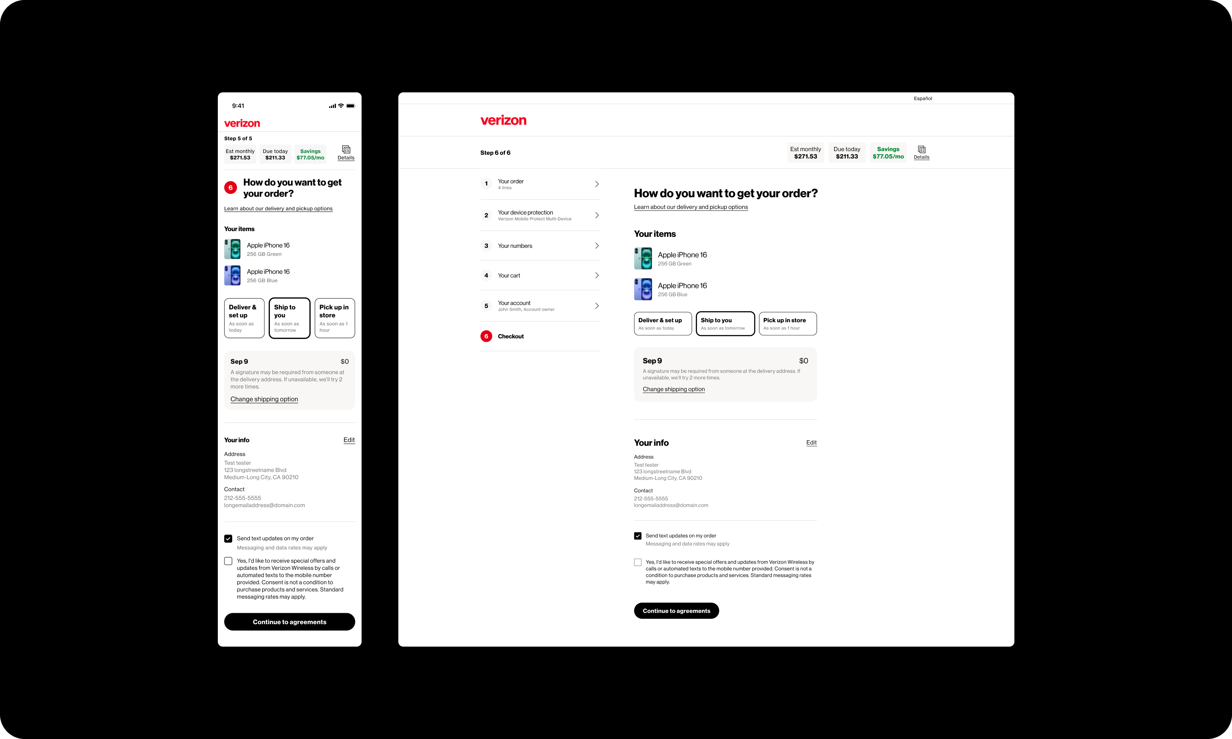
Image 6. (Current iteration) Default page state when the customer is purchasing two phones. The fastest free shipping option is preselected.
Among the numerous edge cases I had to address was one where the customer could select two different in-store pickup locations (for different items) within one order. The problem was that Verizon does not currently support orders with more than one in-store pickup location.
My product and engineering partners did not want to make a changes to the PDP, where the problem was originating. Instead, they wanted me to come up with a bandaid approach to fix the error on the fulfillment step. This captures one of the core mechanics of the development process - designers trying to convince other stakeholders that a greater engineering lift is worth the greater impact on customer experience, compared to a lesser lift with lesser impact.
Besides being a bad experience from an interaction standpoint, I argued if we went in this direction then customers would have had an incorrect mental model of the order for about 90% of the sales flow. Their expectations about being able to pick up their order from two separate stores were untenable - and we knew this from the beginning. This would be especially frustrating after spending time and effort of configuring devices, creating an account with Verizon, going through the credit check, and so forth. I argued it was dishonest for us to do this, and that we should let the customer know there's a roadblock as soon as we're aware of it.
Eventually, the customer experience won the argument and my partners agreed to make this change on the PDP, stopping the problem from happing in the first place. I'm proud that the customer (and common sense) prevailed here. To me, arguing in favor of the customer as just as much a core component of my role as making screens in Figma. A customer's experience has just as much to do with the content on-page as it does with the emotions that arise throughout the flow.
As I write this, the current iteration of the fulfillment experience is in development. I'm excited to start looking at user data and learn about how customers are using the page. The most satisfying part of working on this fulfillment redesign was coming up with a design that is truly modular and scalable. I'm proud that my design withstood many barrages of business rules, bandwidth limitations, and increases in order complexity. I hope it stands up to the real world test of being used every day.
A next iteration of this experience could go many different ways... but personalization based on behavioral data seems like it could be a fruitful avenue. If we could learn more about how people are creating specialized fulfillment schemas for themselves, we could better serve these needs, and perhaps automate some of these processes with machine learning.

